Print production and advice for Diego Zamorra new label for the Orochata variant of 43. In collaboration with the Design Bridge Amsterdam creative team.
My role: Print production, advice on use of paper and finishes. Print testing with Vidal & Armadans label printers in Barcelona. Overall quality assurance.
Unique features/challenges: beautiful balance of foiling, embossing and use of varnishes. Finding the right paper feel, structure and color tone. Many session of fine tuning with the wonderful printers Vidal & Armadans in Barcelona, great specialist and a long time experience in very fine label printing for wines and spirits.
© Photography Design Bridge
A special and uniquely designed and produced New Years gift from the Amsterdam agency Now Even Better to its existing clients and relations. Illustrated typography and design from one of the agency partners Bart Nagel.
My role: Print production, advice on use of production techniques and materials and sourcing suppliers. Testing and press attendance. Overall quality assurance.
Unique features/challenges: Special printing technique used to transfer a ‘clean’ print of the typographic design on to the bottle. Close collaboration with the printer to create a silver print on the label of the box and finding a way to print the beautiful typographic illustration on to the thin paper foil around the bottle, all realized in the best possible digital print execution.
Photography: © 2019 Studio_M
Redesign for the iconic Dutch Brand of Douwe Egberts with Design Bridge design team. Bringing back the old heritage of the brand in a modern way. Bringing in an artist to hand craft the new logo to bring in the warmth of the brand, away from any digital feel.
My role: Print production advice, working with repro houses and printers. Print tests and fine tuning in collaboration with the JDE design to print team.
Unique features/challenges: to make sure the hand crafted feeling was optimally maintained, we did a lot of fine tuning and testing of colors, gradients for al the variants to ensure the quality of all their variants of the printed pack.
© Photography Design Bridge
Print production and design management for collateral exhibition for Adi Da Samraj, the Venice Biennale 2007. Commissioned by Da Plastique and in collaboration with Welcome Books in New York.
My role: Overall print production and quality control for all promotional items, exhibition catalogue, banners and signage in Venice. Translating the design concept to all different promotional items.
Unique features/challenges: All items locally produced around Venice, with excellent Italian printers and prepress specialists. Making sure that all items are produced in time in superb quality, reflecting the high end fine art exhibit of the Artist.
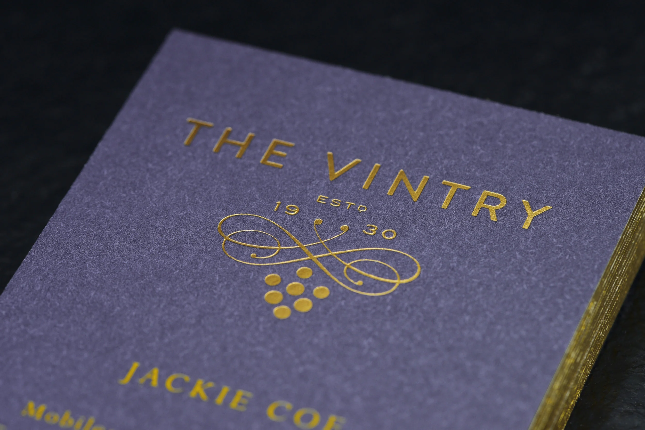
Print production for an exclusive Identity of the VINTRY a new London workspace for the finest in the wine industry. In collaboration with the Design Bridge creative team and especially design director Gary Nettleton.
My role: Print production, advice on use of paper and finishes and sourcing suppliers. Press attendance. Overall quality assurance. Managing time and budget.
Unique features/challenges: bringing together all elements as paper foiling, plus the exact matching of Pantone colors. Making sure that each step of the way was tested to come to the most beautiful and desired result.
© Photography Design Bridge
Print production the bold and beautiful redesign of Danerolles in collaboration with Design Bridge creative team and especially Marloes Oomen.
My role: Print production, advice on best use of print technique in design and illustrations.
Unique features/challenges: to make sure we use bold colors and graphics to compensate with the limitations of the special paper that needed to be printed on in rotogravure.
© Photography Design Bridge
A wonderful project, initiated by a designer and beer brewing employe from Design Bridge. Creating the companies own beer brand, all crafted and hand made.
My role: Print production, advice on use of paper and materials and sourcing suppliers. Press attendance. Overall quality assurance.
Unique features/challenges: trying to make all designs and design elements work in screen print on a rough and very tactile paper. Laser cutting the labels since the batch was too small and delicate to do it another way.
Customer Experience Reference Guide for the management board of Syngenta. Unique experience to open and with a more complex binding of different size signatures into the cover.
My role: Print production, advice on use of paper and materials and sourcing suppliers. Testing printing and binding. Overall quality assurance.
Unique features/challenges: small amount digitally printed on a beautiful uncoated stock. Make sure all elements are tested and are working and the printing is strong and vivid in color. Binding different elements into the cover.
© Photography Design Bridge
Design for a new and innovative drink of JDE in collaboration with Design Bridge design creative team. Developing and testing as well the structural design as the graphic design on the shrink sleeved bottle.
My role: Print production advice, working with repro houses and printers. Print tests and fine tuning in collaboration with the JDE design to print team. Overseeing several rounds of mockup creation for fine tuning and testing as well digital as in rotogravure.
Unique features/challenges: Getting the most out of a shrink sleeve bottle in rotogravure. Working with metallic inks, underpin of white to play with transparency. Fine tuning colors in relation to the organic look & feel of the bottle.
© Photography Design Bridge
A project commissioned by VBAT in their previous building in the Pilotenstraat in Amsterdam. In collaboration with the artist and photographer Hein Hage we were asked to create monumental dividers to help break the open space of the building.
My role: Print production, advice on materials and sourcing suppliers. Print testing. Overall quality assurance.
Unique features/challenges: printed front and back (mirrored) on a material called Mesh, which is an outdoor material with an open structure to let the wind through. In this case it showed a very large full on image from some distance and coming close it would become transparant and not ‘divide’, which was the exact solution we wanted.
Birth Card for Mozes, the first child of my cousin Nirvana and her husband Reinier. I also designed and produced the birth card of Nirvana 34 years before, as the first child of my sister, that I illustrated, typesetted and printed myself.
My role: Design, choices of paper and envelope, selecting the suppliers to produce it, in this case RUPARO Amsterdam for digital print of leafs and Wytze from Fopma Wier in Friesland for the foiling and bonding of the papers and the finish altogether. Excellent work on both parties.
Paper front: Gmund Bio Cycle Chlorophyll Blattgrün 300 g/m2
Paper back: Fedrigoni, Sirio Color Caffè 2 x 300 g/m2, x 2 layers
Unique features/challenges: Finding the means materials and techniques to give this birth card the same heart felt and crafted feel that I did with the birth card for Nirvana 34 years ago.
Link to project @ Monsterkamer, who advised on the paper:
https://www.monsterkamer.nl/projects/oscar-flier-geboortekaartje/
Photography: ©De Monsterkamer, Justina Nekrašaitė
High quality publication of Publisher ‘De Jonge Hond’ and printed at Flevodruk in Harderwijk.
My role: Traffic and print production advice. Initiating and coordinating the website design execution with Amsterdam design agency
Unique features/challenges: managing a complex workflow of design, illustrations and copy in a usually very short production time.
Redesign of the brand GEVALIA in Sweden for the full line of coffee variants with the Design Bridge team.
My role: Print production advice, working with repro houses and printers. Print tests and fine tuning in collaboration with the JDE design to print team
Unique features/challenges: working wit subtle effects of the metallic substrate to get the right metallic feel and glows on to the actual printed substrate.
© Photography Design Bridge
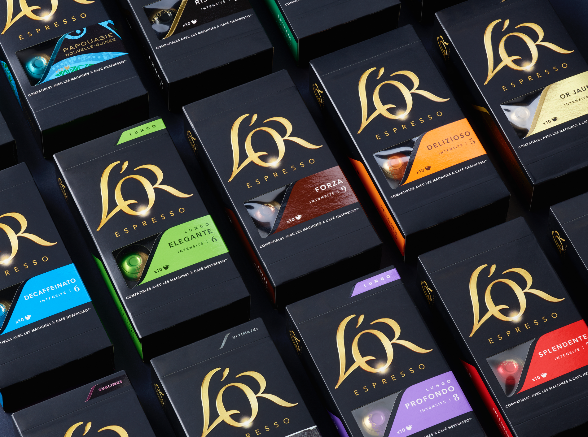
New packaging design for launching L’OR aluminium cups with a large range of variants with the Design Bridge design team.
My role: Print production advice, working with repro houses and printers. Print tests and fine tuning in collaboration with the JDE design to print team
Unique features/challenges: making sure that all variant colors are fine tuned and testing finishes and colored foils with the company Kurz foil.
© Photography Design Bridge
Sikkens rebranding, introduced to internal marketing team. Paint can label in custom made box, with z-Card fold out with aluminum finished back and front.
My role: Print production, advice on use of paper and finishes and sourcing suppliers. Testing print and execution of different elements . Overall quality assurance.
Unique features/challenges: fine tuning all elements in production. Printing on metallic substrate and making sure everything fits perfectly and opens easily.
© Photography Design Bridge
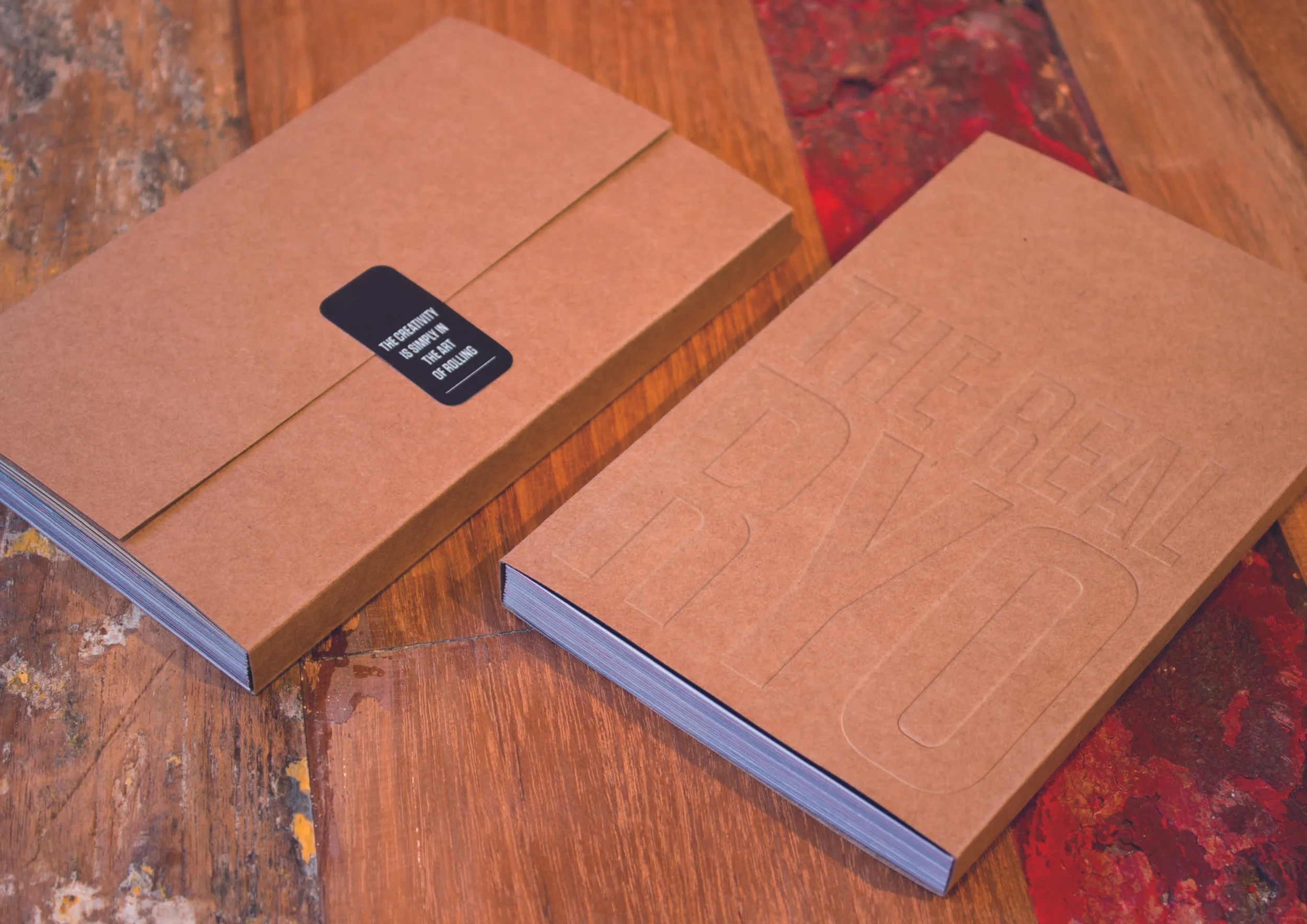
Special small publication for the marketing team of JTI RYO. Photography from different large cities in Europe by young photographer and designer from Design Bridge.
My role: Print production, advice on use of paper and finishes and sourcing suppliers. Print testing and press attendance. Overall quality assurance.
Unique features/challenges: Make sure all elements of paper and print, binding and embossing have the right casual and rough feel that fits the concept.
© photography Design Bridge
Brand cover the Amsterdam store before the opening. Unique and playful design of Design Bridge to inspire the passerby to explore the city of Amsterdam or leave a post-it massage from your favorite place(s) on the map.
My role: Print production, advice on use of materials sourcing supplier. Artwork guidance. Managing the overall production on site. Overall quality assurance, timings and budget.
Unique features/challenges: make sure that the artwork is rightly set up and test that all printed foils fit on all the different forms of even round windows. Make sure communication between all parties involved goes smooth.
© Photography Design Bridge
Duo Delice Brand Book for Purina. Exclusive look and feel for a touchable experience for a manual for one of high end brands of Purina dog food.
My role: Print production, advice on use of paper and finishes and sourcing suppliers. Overall quality assurance. Managing time and budget.
Unique features/challenges: Finding and sourcing a unique soft cover material. Finding a supplier for dog collars that was able to make the dog collar around the brand manual. Very close collaboration and testing with the binder.
© Photography Design Bridge
Many different tests, mock up creation and press attendance for the Spanish brand Suchard from Mondelez.
My role: Print production advice, working with repro houses and printers. Print tests and fine tuning in collaboration with lithographers, printers, client and creative team of Design Bridge. Attending on press many times in different places in Europe to ensure the most optimal execution in production.
Unique features/challenges: Making the most use of the given finishes in as well paper/carton as on flexible materials. Really making sure the product is really well printed and tasty and colors are vivid and bright and on brand.
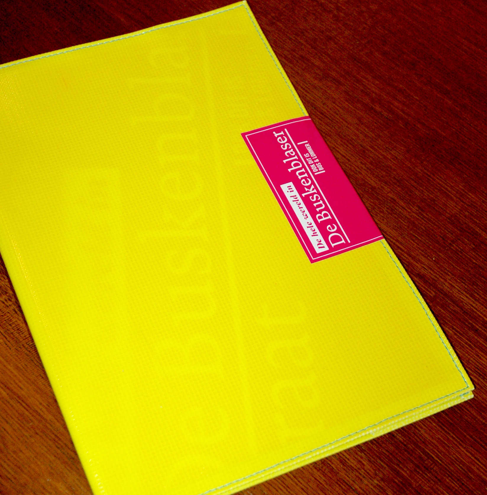
Print production for a bold brochure for a real estate project for a young audience in Bos en Lommer in Amsterdam, commissioned by Qua Associates.
My rolel: Print production, advice on use of paper and materials and sourcing suppliers. Press attendance. Overall quality assurance. Managing time and budget.
Unique features/challenges: boat canvas used for the cover, screen printed yellow, finished with a cyan thread and closed with magenta sticker.
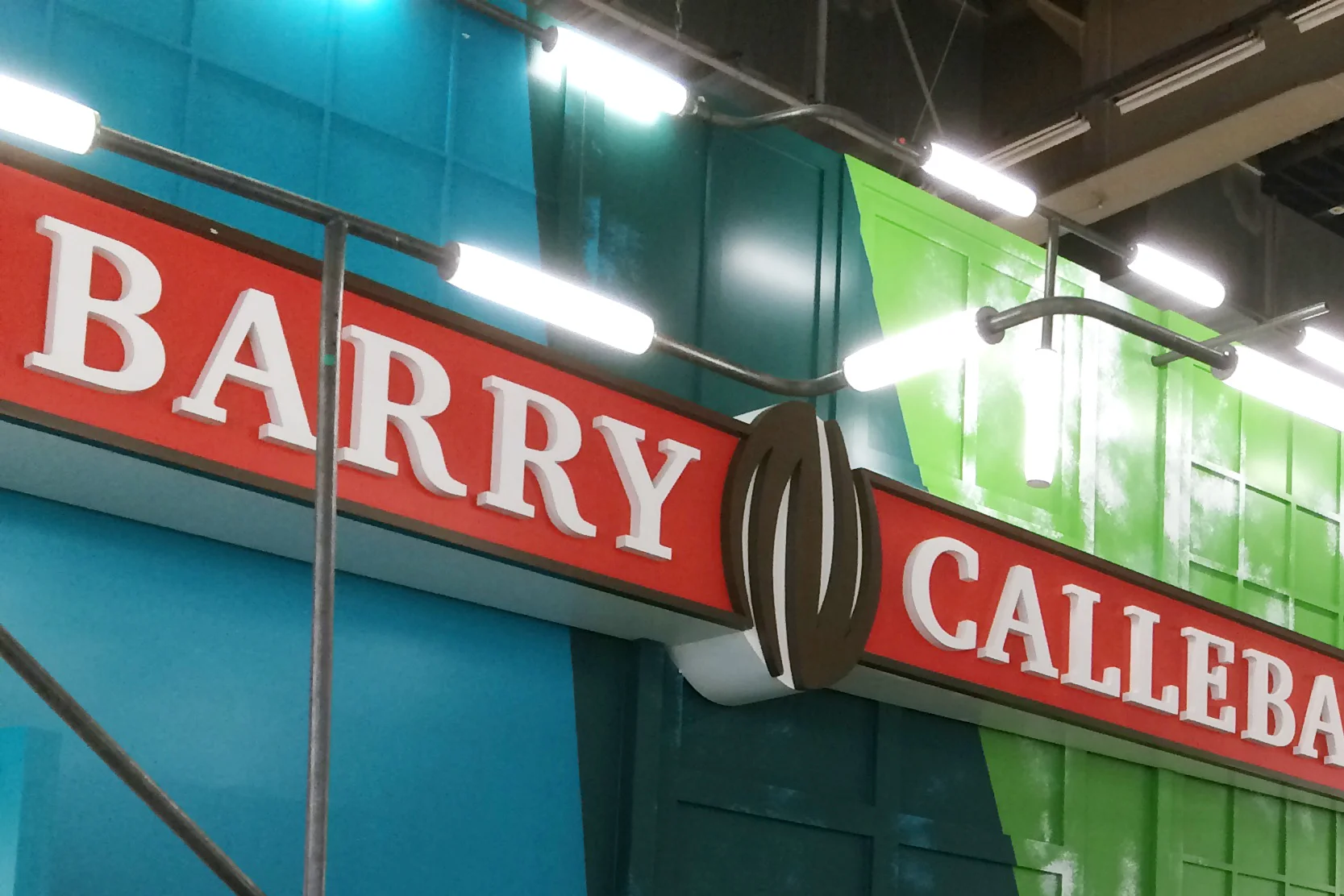
Realization of a brand new concept for the chocolate giant Barry Callebaut by Design Bridge. The concept is an artist studio for network and promotion of the brand. They invited the best chocolatiers in the world to taste and experience the wonderful world of chocolate.
My role: Print production for all promotional items. Posters, brochures, bags and chocolate gift boxes, all created in the sphere of studio crafting. Sourcing the supplier to build and realize the unique stand concept.
Unique features/challenges: Barry Callebaut has its own stand builders team. In this case they were not able to build the complex wall of 20 x 5m. I connected them with the company Anything Is Possible who are specialized realizing and building everything that seems impossible… They did an excellent job and are after a few years still closely connected to the Barry Callebaut stand building team.
Each year Diageo works with a uniquely talented upcoming or established artist to help inspire and create the gift packaging. You see how the paper artists here create beautiful pieces, that are later filmed and photographed to inspire and feed the creative agency that designs the packaging. This one was created by Design Bridge, which has a great history in designing the JW gift packaging.
My role: Print production advice, working with repro houses and printers already established by Diageo.
Unique features/challenges: Many kinds of finishes and effects needed to be tested and guided to come to the most bold and convincing result that reflects the unique artists creation and of course the brand.
© Photography Design Bridge
Real Estate brochure for the then still be build Smederij located at NDSM, one of the area’s most in development in Amsterdam. This brochure was designed by Qua Associates and they asked me to execute the design, maintaining the rough industrial feel, reflecting the area where the building would be build.
My role: Print production advice. Sourcing materials and suppliers. Final quality control.
Unique features/challenges: Bringing together different materials, all treated and finished in a unique way and to make a smooth sliding brochure in a lasercut craft carton.
Annual Report after the full corporate redesign from Design Bridge. Beautiful and integrated design reflecting the fresh start of a new era of LeasePlan. In collaboration with Ambitions in Den Bosch.
My role: Print production advice on use of paper and finishes Overall quality assurance. Press attendance.
Unique features/challenges: Coming to interesting and engaging solutions for papers and the binding. Making sure the transparent sleeve fitted wel around the report and maintaining great print quality under high pressure of time and budget.
© Photography Design Bridge
Colorful and theatrical theme for the redesign of the Tassimo Brand embodying the new concept that Design Bridge developed.
My role: Print production, advice on use of paper and finishes and sourcing suppliers. Testing print and execution of different elements . Overall quality assurance.
Unique features/challenges: Executing the Brand Book with a combination of silver and different colored cartons at the core. Testing the unique way of binding to make sure that the carton at the core shows itself. Sourcing and applying a large self adhesive brand sticker to connect the closure of the book.
First art book of the Artist Adi Da Samraj with black and white photography, connected to the first exhibition of his artistic work in California, USA.
My role: Print production, advice on use of paper and finishes and sourcing suppliers. Testing print and execution of different elements . Overall quality assurance.
Unique features/challenges: Sourcing the best possible fine art printers in the US, for which was chosen Meridian Printing in Rhode Island. Extensive work on getting the original dark room prints scanned. This was followed by long hours of press attendance to honor every detail of the printed image to the original prints. Producing as well a soft cover as a limited edition hard cover in sleeve.
A Catalogue for the sales team from Barry Callebaut designed on basis of the new Barry Callebaut concept developed by Design Bridge. All the paper used has actual fibers from the cocoa shell form the the cocoa beans from Barry Callebaut. A paper made by the paper mill of James Cropper in Scotland.
My role: Print production, advice on use of paper and finishes and sourcing suppliers. Testing print and execution of different elements . Overall quality assurance.
Unique features/challenges: To print clearly on a strong and rigid craft paper is a challenge. To find the balance between a good image and making use of the natural character of the paper/carton. The white was screen printed to make sure we had a bright white with some body to it and reads well.